ShopDreamUp AI ArtDreamUp
Deviation Actions
Why Inking?
What's inking matter anyway?
Who notices good or bad inking?
Jim Lee. Bryan Hitch. Alan Davis. John Romita Jr. Editors. Original Art Collectors.
Thank God people still care. A few years ago if you'd have informed me that one day I'd be writing an article extolling the virtues of inking, I'd have thanked you for a good laugh, then excused myself to stand in the unemployment line. This inaugural column will offer an overview of it's intent, and touch on the basics of inking. I will revisit and expand on several points in later installments.
I must admit feeling disarmed when someone asks me again and again what an inker does. My best friend Deerwood and I seemed to grasp the concept in our teens. Back then, however, with the crude printing and coloring techniques of the pre-Image era, the inker's role was vital in a quality product. During this period, (our particular Golden Age), Marvel was breaking away from their old 'house style' with maverick inkers who could dress up crude upstarts and tired old workhorses. Mavericks named Terry Austin, Klaus Janson, Bobs Layton and McLeod, Joe Rubenstein.
Nowadays, you can excuse the occasional weak panel or page, praying the modern maestros of coloring will bury any flaws. There are also pencillers who draw tight enought that scanning directly from the pencils is viable. Many modern coloring effects have taken over the responsibility of textures. None of these advances excuse poor inking. History lesson over. Begin motivational speech.
First word of advice: Sacrifice! Unplug the Playstation, turn the TV off, don't see every crappy movie that comes out, and tell your friends (and that cute girl who likes you) that you're busy this weekend! Repeat. Easy as that. You wanna see your name in print? Get busy!
A good way to try your hand at inking is to solicit pencil photocopies from your favorite publishers. Sending a SASE is a the way to go. Experiment with brushes, rapidograph pens, quills, etc. Invest in the right supplies. There are great starter kits available. Once you've settled on your weapons of choice, be patient. It takes lots of practice to train your hand and gain confidence.
Most common convention questions:
If you mess up, what do you do?
Everybody makes mistakes. Pro White is my best friend. Before inking, make a good photocopy of the pencils to refer to. When you make a mistake, mark the area on the copy with a hightlighter. When you're done inking and erasing, consult the copy and fix the mistakes.
What's the right way to hold an inking tool? And which tools?
Whatever feels comfortable. When watiching different pros at work, you'll notice that they all have their different nuances. No two pros have the same calluses on their hands. As for tools, find out what your favorite inker uses if you wish to emulate his/her style.I use lots of different ones depending on many factors: style, environment, the penciller's tight or loose details, or even how hard the penciller bears the pencil lead down.
What style should I attempt?
Try several, but cater your samples to specific publishers. Wildstorm artists tend to use crackly, stop-start craggy quill work. Manga-style artists prefer cleaner rendering and ruled, slick speedlines. More on that another time.
Once you've taped the page down, can you pull it off and move it around?
I've heard this one more than you'd believe. Comic book artists develop a sweeping curve motion in their wrists, constantly sliding the page around to draw anything from baggy uniforms to missile silos at outrageous perspectives. Nobody draws straight up, down and across like an Etch-A-Sketch (c).

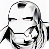
I have a certain angle and way I pull my brush (a Raphael series 8404 #1) to achieve certain lines. If the item I'm inking is, lets say, Batgirl falling upside down, I'll tilt the page so she's right-side up, then ink her like I would normally. Most of the page is inked right-side up, but an upside-down face could be horribly misinterpreted if you don't see it properly. Developing a sweeping curve motion is critical in inking (see Figure A). Keep practicing enough and you can achieve a row of lines for a flowing feathering effect (see Figure B). Then you can add to that principle, making each succeeding featherline build into black by bearing down on your brush or quill (see Figure C). Keep in mind: if you screw up in the middle of feathering, don't stop the feathering action. Continue your flow and fix the bad lines later. It's very difficult to resume a brush pattern in the middle of a row of lines. Let's address the Judge Dredd head shot. Notice the difference between his helmet's shine and the rough quality of his face. The helmet has been translated into simple graphic shapes but the face has crosshatching, which denotes half-tone, fleshy shapes. Both can coexists in the same image to convey the differences of textures. There's no mistaking where the helmet ends and the face begins. On both the top left and center of the helmet, the thin-to-thick lines (also known as tapers, as they 'taper' off to a point) are even. Brian Stelfreeze taught me that not only should the black tapers bend to the shape you want, but the negative white space between the tapers should also. It serves a pleasing, orderly, and sharp graphic effect.
Also note on the lower right of Dredd's helmet where I threw in a little drybrush effect. It's just a quirky little last-minute addition to suggest a light sourse slightly diffusing.

It was just one of those happy accidents that worked. The shape of the helmet was inked with a rapidograph pen and ship curves, which I prefer to french curves.
French curves and ship curves are plastic ruling tools, perfect for inking a car hood, a hunting bow, etc. I prefer ship curves because french curves have too many abrupt bends in the angles. Ship curves have nice long, gradual teardrop shapes which are very versatile when inking a space ship in perspective. Ship curves usually come in a set of five for under twenty bucks.
Why inking?
Because I'm a slow, modestly-talented penciller, but a pretty good inker. And the comics industry doesn't need more slow, modestly-talented pencillers.
What's inking matter anyway?
Who notices good or bad inking?
Jim Lee. Bryan Hitch. Alan Davis. John Romita Jr. Editors. Original Art Collectors.
Thank God people still care. A few years ago if you'd have informed me that one day I'd be writing an article extolling the virtues of inking, I'd have thanked you for a good laugh, then excused myself to stand in the unemployment line. This inaugural column will offer an overview of it's intent, and touch on the basics of inking. I will revisit and expand on several points in later installments.
I must admit feeling disarmed when someone asks me again and again what an inker does. My best friend Deerwood and I seemed to grasp the concept in our teens. Back then, however, with the crude printing and coloring techniques of the pre-Image era, the inker's role was vital in a quality product. During this period, (our particular Golden Age), Marvel was breaking away from their old 'house style' with maverick inkers who could dress up crude upstarts and tired old workhorses. Mavericks named Terry Austin, Klaus Janson, Bobs Layton and McLeod, Joe Rubenstein.
Nowadays, you can excuse the occasional weak panel or page, praying the modern maestros of coloring will bury any flaws. There are also pencillers who draw tight enought that scanning directly from the pencils is viable. Many modern coloring effects have taken over the responsibility of textures. None of these advances excuse poor inking. History lesson over. Begin motivational speech.
First word of advice: Sacrifice! Unplug the Playstation, turn the TV off, don't see every crappy movie that comes out, and tell your friends (and that cute girl who likes you) that you're busy this weekend! Repeat. Easy as that. You wanna see your name in print? Get busy!
A good way to try your hand at inking is to solicit pencil photocopies from your favorite publishers. Sending a SASE is a the way to go. Experiment with brushes, rapidograph pens, quills, etc. Invest in the right supplies. There are great starter kits available. Once you've settled on your weapons of choice, be patient. It takes lots of practice to train your hand and gain confidence.
Most common convention questions:
If you mess up, what do you do?
Everybody makes mistakes. Pro White is my best friend. Before inking, make a good photocopy of the pencils to refer to. When you make a mistake, mark the area on the copy with a hightlighter. When you're done inking and erasing, consult the copy and fix the mistakes.
What's the right way to hold an inking tool? And which tools?
Whatever feels comfortable. When watiching different pros at work, you'll notice that they all have their different nuances. No two pros have the same calluses on their hands. As for tools, find out what your favorite inker uses if you wish to emulate his/her style.I use lots of different ones depending on many factors: style, environment, the penciller's tight or loose details, or even how hard the penciller bears the pencil lead down.
What style should I attempt?
Try several, but cater your samples to specific publishers. Wildstorm artists tend to use crackly, stop-start craggy quill work. Manga-style artists prefer cleaner rendering and ruled, slick speedlines. More on that another time.
Once you've taped the page down, can you pull it off and move it around?
I've heard this one more than you'd believe. Comic book artists develop a sweeping curve motion in their wrists, constantly sliding the page around to draw anything from baggy uniforms to missile silos at outrageous perspectives. Nobody draws straight up, down and across like an Etch-A-Sketch (c).
I have a certain angle and way I pull my brush (a Raphael series 8404 #1) to achieve certain lines. If the item I'm inking is, lets say, Batgirl falling upside down, I'll tilt the page so she's right-side up, then ink her like I would normally. Most of the page is inked right-side up, but an upside-down face could be horribly misinterpreted if you don't see it properly. Developing a sweeping curve motion is critical in inking (see Figure A). Keep practicing enough and you can achieve a row of lines for a flowing feathering effect (see Figure B). Then you can add to that principle, making each succeeding featherline build into black by bearing down on your brush or quill (see Figure C). Keep in mind: if you screw up in the middle of feathering, don't stop the feathering action. Continue your flow and fix the bad lines later. It's very difficult to resume a brush pattern in the middle of a row of lines. Let's address the Judge Dredd head shot. Notice the difference between his helmet's shine and the rough quality of his face. The helmet has been translated into simple graphic shapes but the face has crosshatching, which denotes half-tone, fleshy shapes. Both can coexists in the same image to convey the differences of textures. There's no mistaking where the helmet ends and the face begins. On both the top left and center of the helmet, the thin-to-thick lines (also known as tapers, as they 'taper' off to a point) are even. Brian Stelfreeze taught me that not only should the black tapers bend to the shape you want, but the negative white space between the tapers should also. It serves a pleasing, orderly, and sharp graphic effect.
Also note on the lower right of Dredd's helmet where I threw in a little drybrush effect. It's just a quirky little last-minute addition to suggest a light sourse slightly diffusing.
It was just one of those happy accidents that worked. The shape of the helmet was inked with a rapidograph pen and ship curves, which I prefer to french curves.
French curves and ship curves are plastic ruling tools, perfect for inking a car hood, a hunting bow, etc. I prefer ship curves because french curves have too many abrupt bends in the angles. Ship curves have nice long, gradual teardrop shapes which are very versatile when inking a space ship in perspective. Ship curves usually come in a set of five for under twenty bucks.
Why inking?
Because I'm a slow, modestly-talented penciller, but a pretty good inker. And the comics industry doesn't need more slow, modestly-talented pencillers.
www.drewgeraci.com website relaunch today!
Thanks to my pal, Chris Kozak, for revamping my site, www.drewgeraci.com . All the social media attachments, interviews and other stuff. Hope you dig it! All-New blogs to come soon!
Devious Journal Entry
Next weekend, September 26-28 I'll be attending the Nashville Wizard World convention at Music City Hall. I'll also be hosing a 'how to ink' panel on Sunday @ 2pm. http://www.wizardworld.com/drewgeraci.html
Superman splash page Ebay sale ends TONIGHT!
TONIGHT my Ebay auction for the Futures' End #15 PAGE 1 (Superman splash) ENDS.
THIS IS THE ORIGINAL!
IT IS NOT THE KNOCK-OFF RECREATION THAT WAS SOLD LAST WEEK BY A COPYCAT! Pencilled board inked by me, published by DC.
This is not blueline inks. www.ebay.com/itm/SCOT-EATON-DCS-FUTURES-END-15-pg1-PUBLISHED-SPLASH-INKED-BY-DREW-GERACI-/281424162258?ssPageName=ADME:L:LCA:US:1123
Future's End #15 splash auction ends in 1 day!
Wednesday evening, my Ebay auction for the Futures' End #15 PAGE 1 (Superman splash) ends. IT IS THE ORIGINAL, NOT THE RECREATION BY ANOTHER THAT WAS SOLD LAST WEEK! Pencilled board inked by me, published by DC. www.ebay.com/itm/SCOT-EATON-DCS-FUTURES-END-15-pg1-PUBLISHED-SPLASH-INKED-BY-DREW-GERACI-/281424162258?ssPageName=ADME:L:LCA:US:1123
© 2014 - 2024 DrewGeraci
Comments0
Join the community to add your comment. Already a deviant? Log In